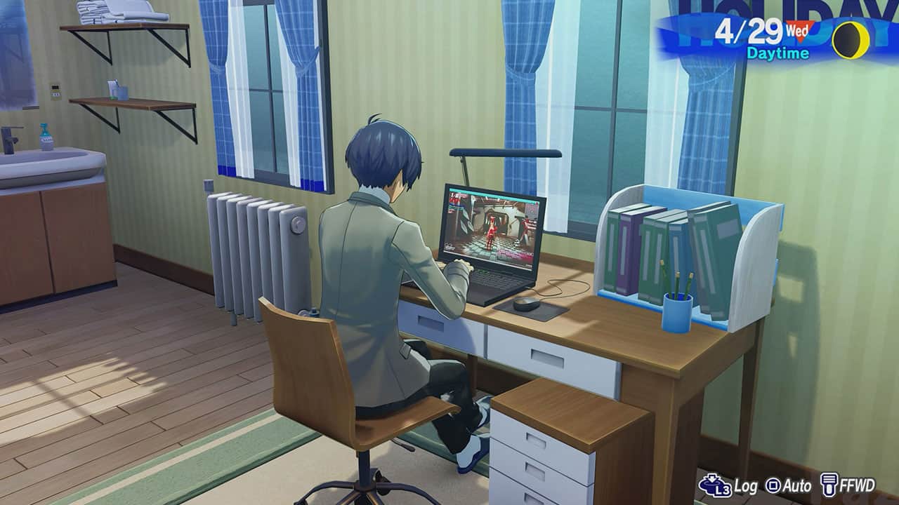
Modern Persona series’ stylish UI might be one of its most recognizable features today, yet its origins weren’t about purely looking cool and edgy. It was mostly born out of necessity and practicality, especially when Atlus couldn’t afford much for the massive directional change the RPG series took with Persona 3. While it’s not exactly a top secret these days, it was one of many stories the team revisited in Famitsu Issue 1964’s Persona 30th anniversary roundtable. What’s interesting, however, is how a relic of the early internet ended up shaping said iconic visual identity.
Persona series producer Kazuhisa Wada, who served as design director on the original Persona 3, had already discussed budget constraints in a previous Famitsu interview. With the series’ future uncertain after the second game, the development team was pushed to make drastic changes. At the same time, other studios were pushing the PS2’s hardware to its limits during that period. Compared to something like Okami, Black, and God of War 2, the Persona staff couldn’t afford such luxury. It needed to do something fast — and it had to be cheap.
“For us at that time, competing on visual fidelity simply wasn’t an option. We couldn’t afford that level of cost, so we wondered how to refine the overall visual of the work… and one of the answers we arrived at was the UI,” he explained. The designers turned their heads to a popular tool emblematic of the early 2000s internet era: Adobe Flash. “The technology isn’t used anymore, but there were a lot of companies making interactive websites using Flash, right?” recalled Wada. “Sort of like, just moving the cursor already felt exciting, so I thought wouldn’t it be great if we could pursue that kind of impact within the game’s UI?”
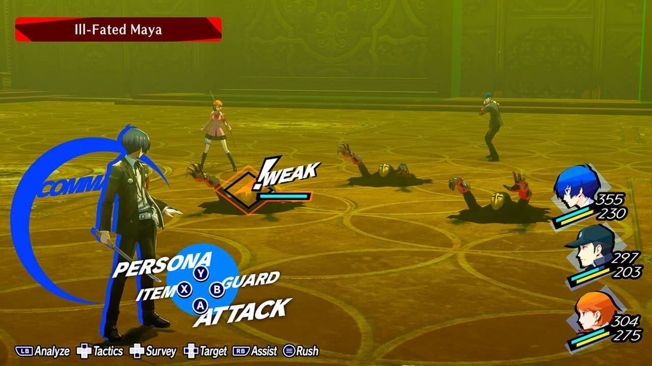
The team then decided to comb through corporate websites from various industries of the time and brainstorm what kind of look would best establish Persona‘s new identity. According to Wada, while making the UI work required plenty of artistic sense, it could be achieved without spending too many resources. Said approach apparently offered a ‘ray of hope’ during development.
The funny thing is, two decades later, that cost-conscious experiment has flipped on its head. Wada pointed out Atlus now dedicates an ‘appropriate amount’ of resources to UI development because fans have come to recognize it as one of Persona‘s biggest selling points. The team also faces mounting expectations to make each game’s navigation menus stylish while fitting the tone they’re after. “Now that the UI has become the ‘face’ of the game, we have to consider what it should be like to live up to everyone’s expectations. We’re still going through trial and error on that,” he elaborated.
Shoji Meguro, the longtime series composer who has since gone freelance, chimed in that Persona 3‘s developing visual identity also helped shape its equally distinctive soundtrack. Once the scenario’s structure and UI feel had solidified, he could finally picture the finished game in his head. “‘This kind of music would probably fit,’ I thought,” Meguro recalled. He added that Changing Seasons was likely the first musical piece he made to represent this new direction, which immediately got the thumbs-up when he sent it to director Katsura Hashino for review.
If you old-school gamers ever thought those Flash websites were too gaudy, well, you apparently have them to thank for Persona‘s distinct menus and style. For more news and interviews, keep an eye on GameObserver.



 ObserverCrew Picks
 bserver
 bserver